
Project 2: Electoral Maps
QGIS was used to create county-level electoral maps for 2012 and 2016.
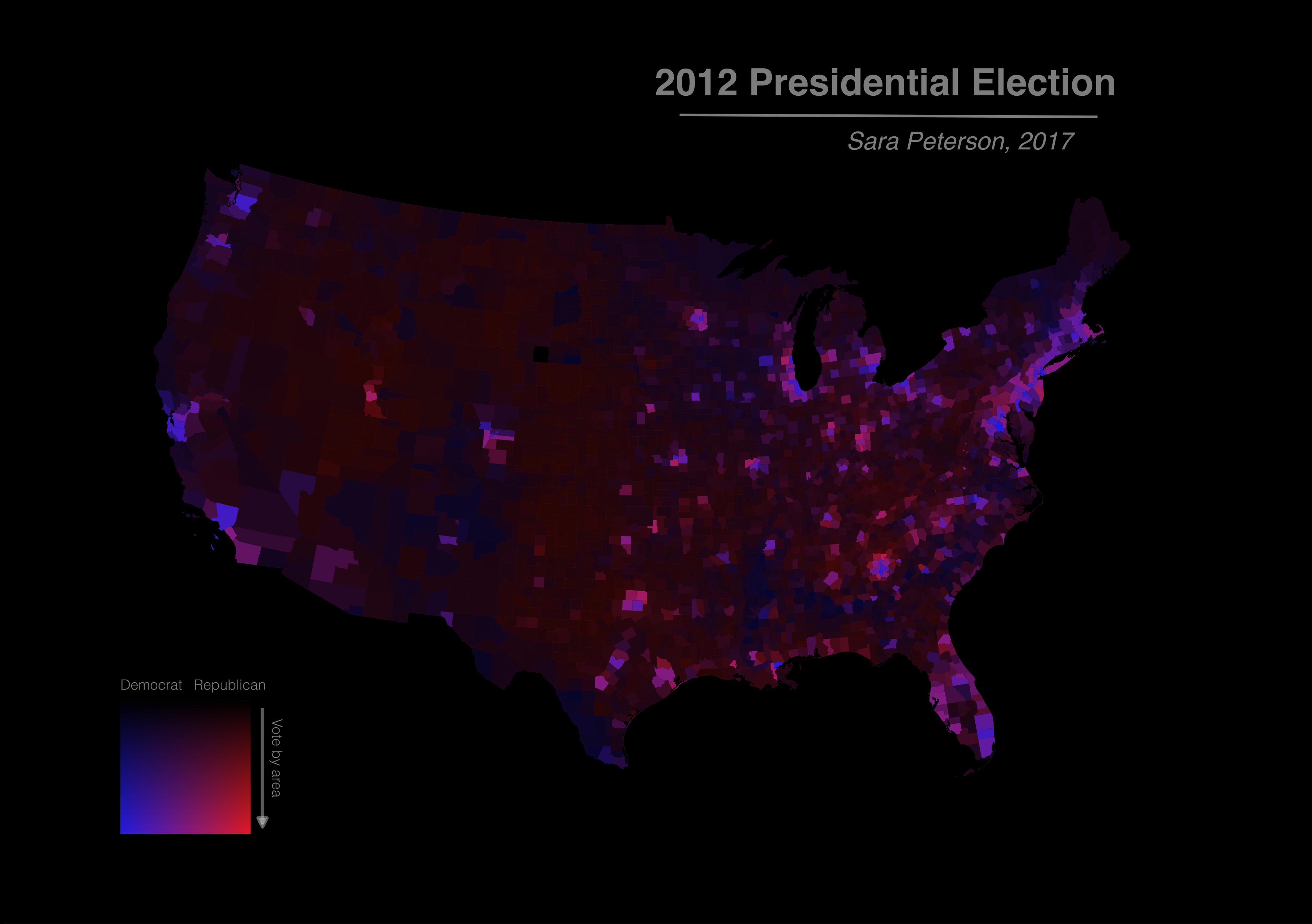
The choropleth map seen below shows the election results for 2012. In addition to the color gradient indicating the distribution of voting along partisan lines, the brightness of the map reflects the voting density of each county: brighter counties indicate regions where relatively more votes were cast, while darker regions indicate regions where relatively fewer votes were cast. The creation of this map involved using QGIS to overlay a choropleth map of county-level election results (red for Republican; blue for Democrat) with a transparency layer of voting density (more transparent indicating relatively more votes cast.)
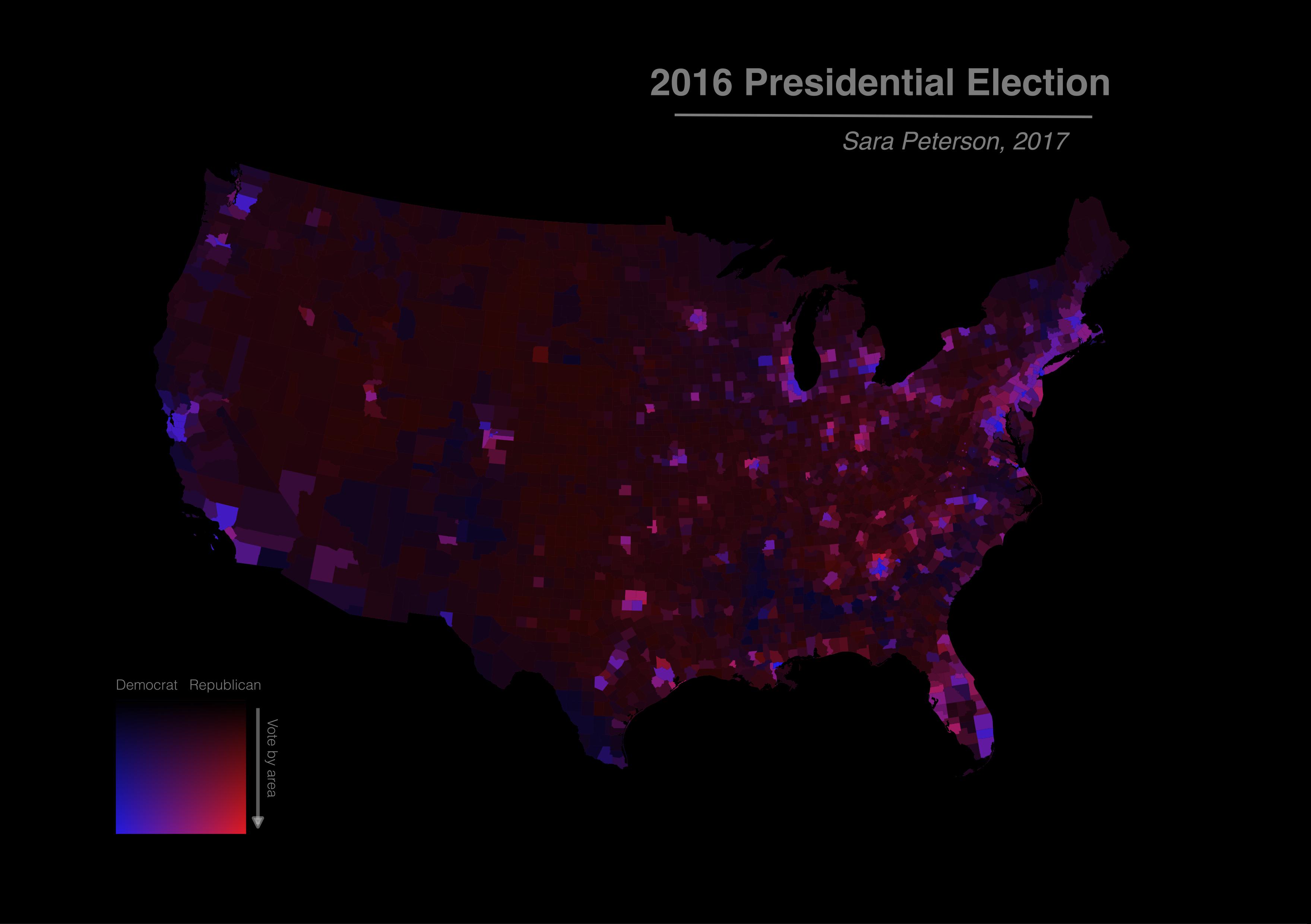
The choropleth map seen below was created using an identical process, but using the data from the 2016 election. Though the map below appears nearly identical to that above, close inspection reveals that several counties have changed color (many have become more Republican) and the map appears "brighter" overall, particularly in Mid-Western states, suggesting an increased voter turnout in those regions.
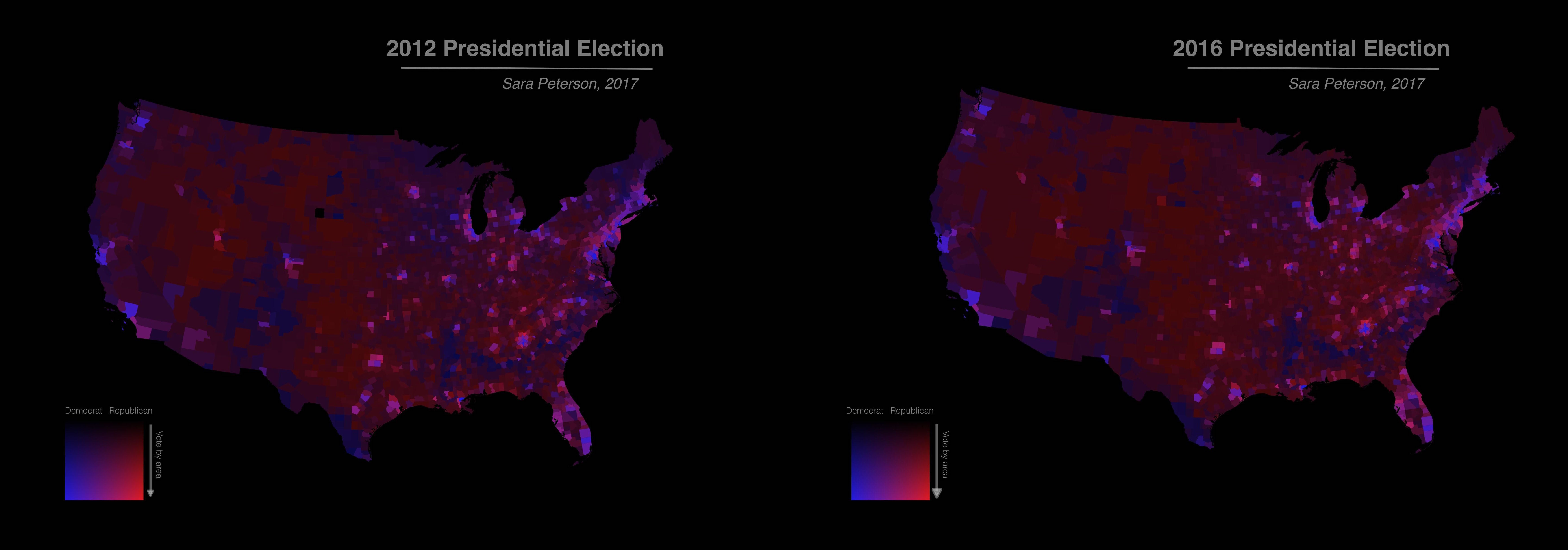
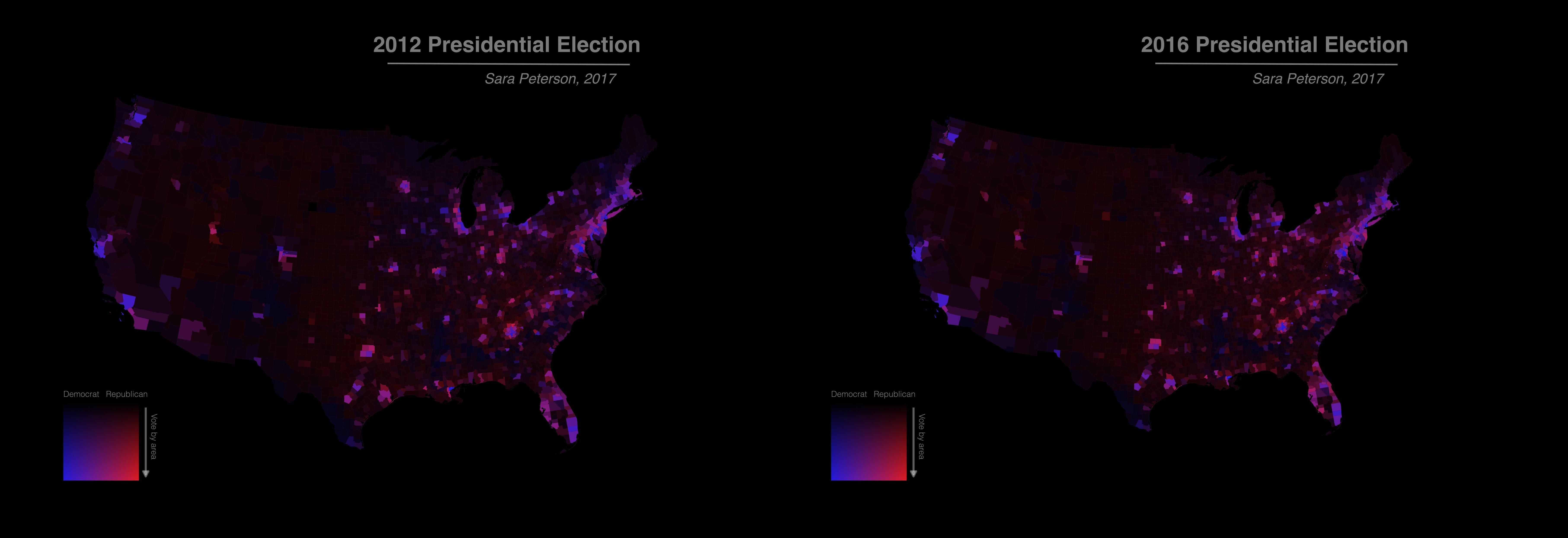
The following series provides a side-by-side comparison of data from the 2012 and 2016 presidential elections with different visualizations.
The maps below visualize the data by assigning the voting density relatively low weight.
The maps below visualize the same data, but assign much higher weight to the voting density.
Data for the county-level election results downloaded from GitHub.com. County-level shapefiles downloaded from US Census Bureau.