Class 9 Outline
1. Project 1 Feedback
Projects will be graded with the following Grading Rubric
Common Issues
1. Title should be something like:
Report 1: U.S Names Study Your Name and Student Number Class 448 (or 563) Date
This time, I didn’t take off points provided that you had something.
2. Introduction:
Most eveyone had good motivation for their study. However, many people lost points becuase they did not give an introduction to the dataset:
Where did it come from? Did you download it? From where? What is the data format (i.e., csv, json, ...). What is the data structure (i.e., (name,gender,year) ).
3. Body
This should be organized into clear sections.
These sections should include paragraph descriptions and figures and/or tables. Not a list of results.
4. Figs/Tables
All figures need axes labels. It is a good habit to give them Titles and label them Figure 1, Figure 2, ... In your paragraphs, you can refer to them using thier figure reference.
5. References
Use numbers (or some naming scheme) to organize references as a list. Cite references as you use them in the report. Don’t just give a list at the end. All references should be forward-referenced.
6. Code
Your jupyternotebook should end with a block of code that runs without errors. Adde lots of comments to your code.
7. Other
Submit the correct format.
General Thoughts/Discussion
Should you embedding data: yes or no?
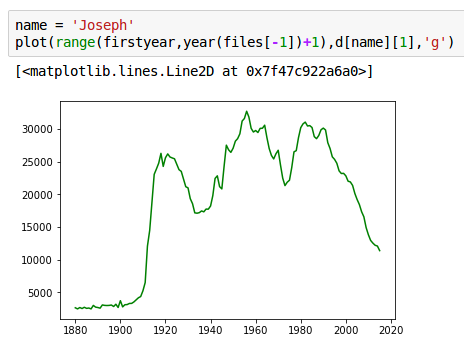
Yes, give the reader a feel for the data you're dealing with.
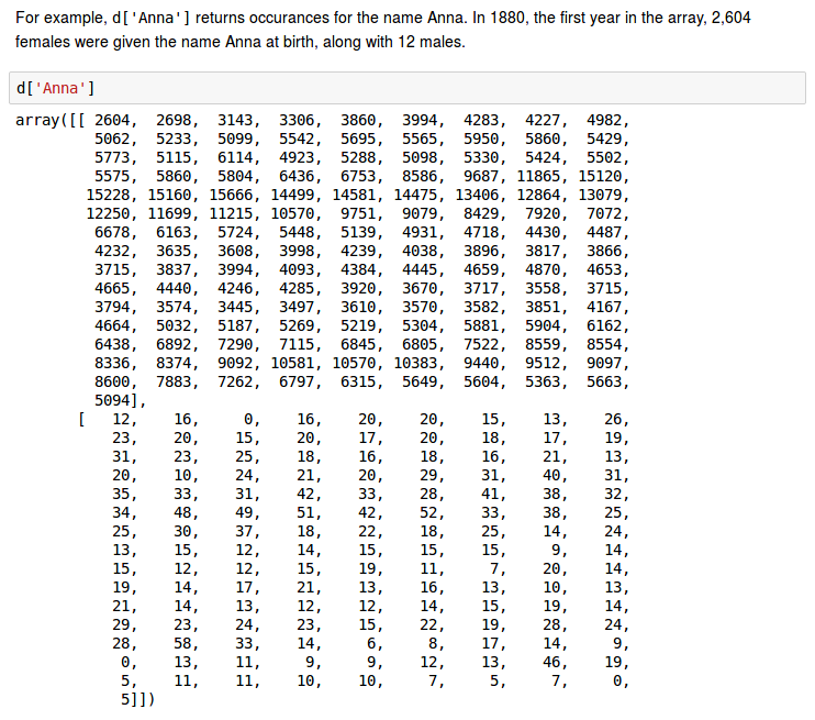
Here's an example:
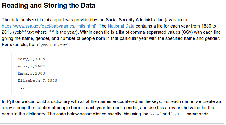
The following is bigger but still fits on one screen, and is very helpful in conveying to the reader how you have processed the data:
 But no, do NOT include long lists, tables that extend over multiple screens, that no one is going to read. Include this kind of material in an Appendix if you think it's vital to have for reference.
Scaling things out
number of steering complaints / number of complaints
number of complaints / number of cars
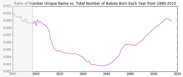
number of Elizabeths / total number of births
Shifting axes
Life-cycle of names, pulses of popularity
Perhaps we could shift and rescale every name to place their peaks of popularity all at the same point, and see how the distribution looks.
Taking logarithms
big, small, very small
zero must be a special value! (not an arbitrary origin)
Miscellaneous
Stacked histograms can be bad.
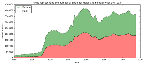
Obscures what's going on for every layer except the lowest.
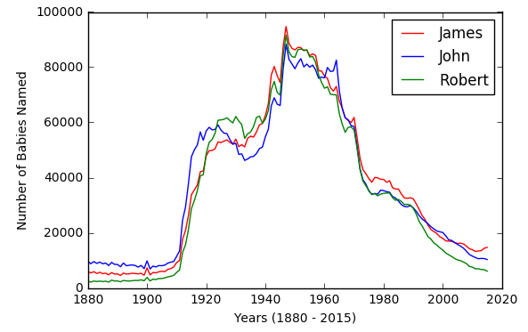
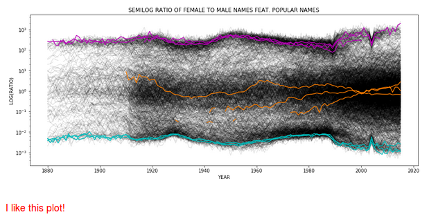
How many curves in a plot?
A few is good. Very many can be good. Intermediate not so much.
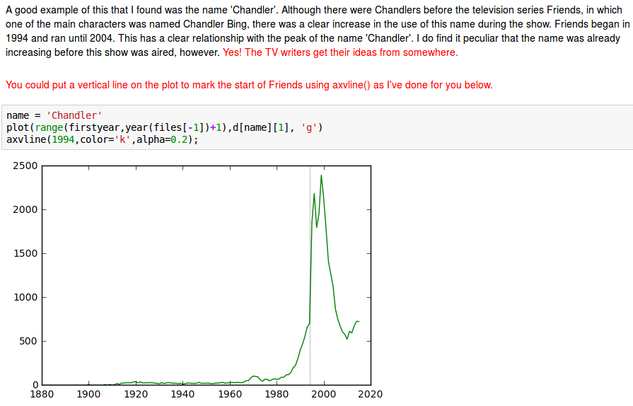
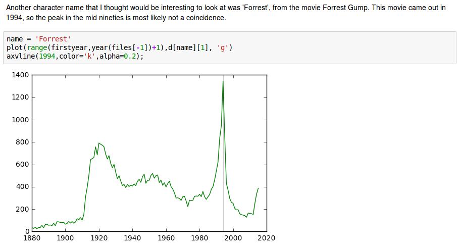
Combining anecdote with entire population statistics A think this picture is striking:
Dramatic influence of entertainment industry
Rotating axis labels
plt.xticks(np.arange(1940,1986,1),rotation=60) plt.xlim(1940,1985)

Legend outside the box
plt.legend(bbox_to_anchor=(1.05, 1), loc=2, borderaxespad=0.) #(Hui Duan) gives external legend.