Chloropleths
From Wikipedia: A choropleth map (from Greek χῶρος ("area/region") + πλῆθος ("multitude")) is a thematic map in which areas are shaded or patterned in proportion to the measurement of the statistical variable being displayed on the map, such as population density or per-capita income.
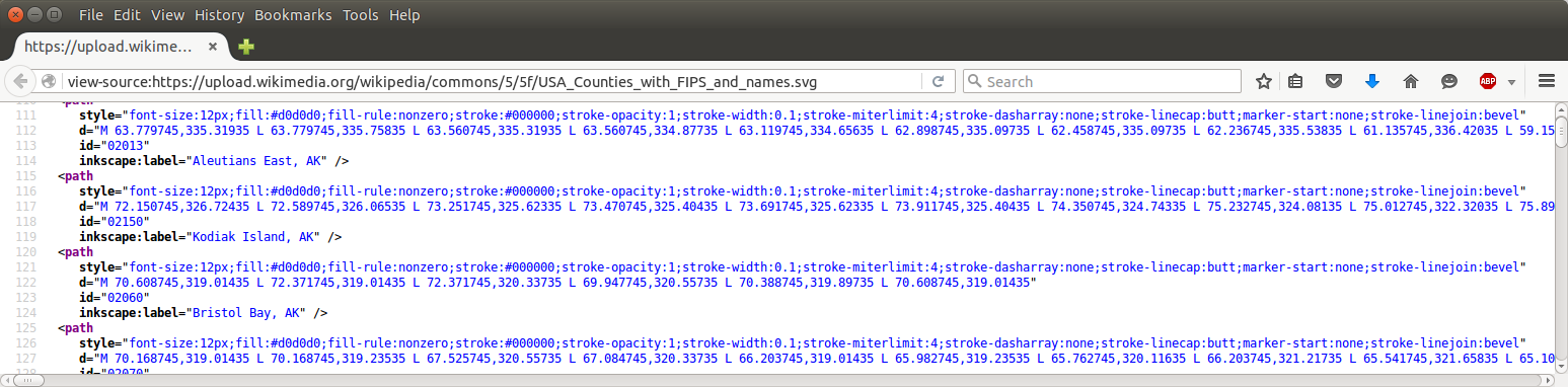
Save this blank map of US counties as an svg to a local folder.

View its source code in your browser.
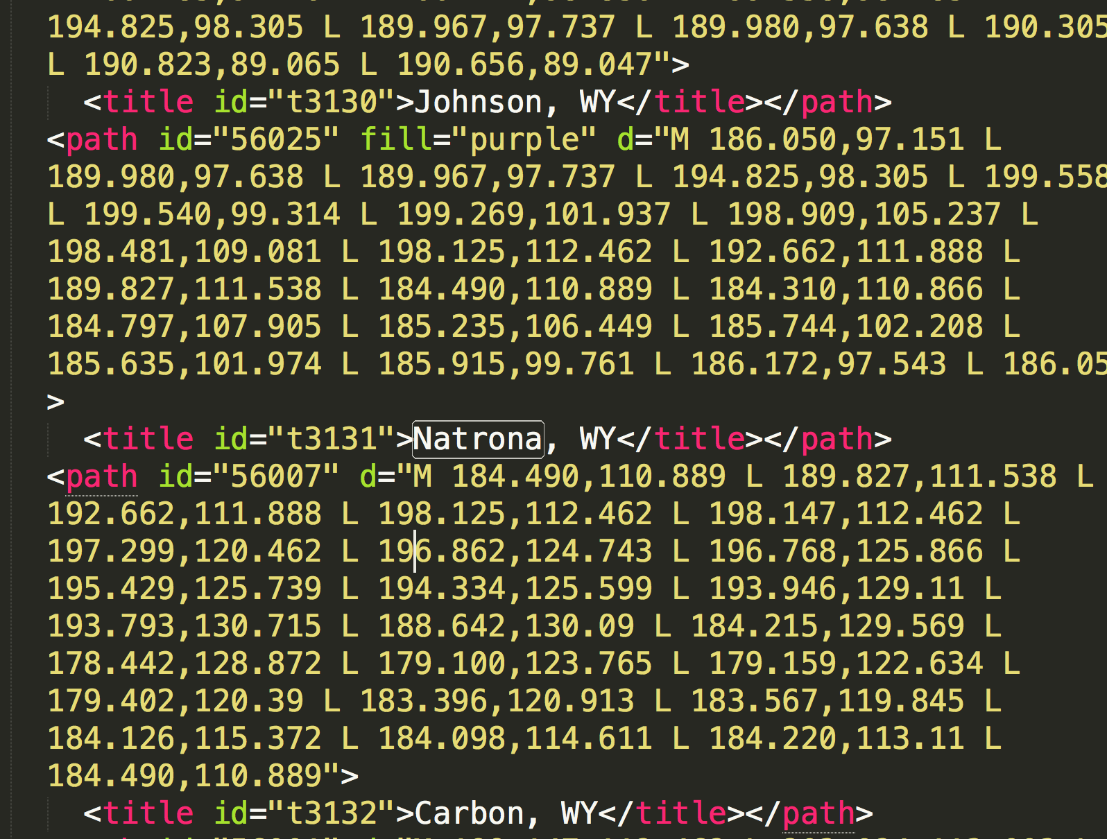
Edit it with a text editor (gedit, brackets, atom, vi, emacs, sublimetext, etc.).
and ...
Color the county where you were born with some bright color of your choice, and check it in your browser. If you were not born in the USA, consider yourself an honorary Erie County native.
from IPython.display import SVG, display
display(SVG('my_county.svg'))
See further information about svg and paths here.
Report 2: due Saturday March 17 at midnight
Find some interesting data for every county in the US Search online for some data given for every county in the nation.
You may want to consult this page about the FIPS codes for counties.
Fall-back suggestion: if you don't find anything else good: annual unemployment data from the US Bureau of Labor Statistics.
Color the counties on the map according to your data
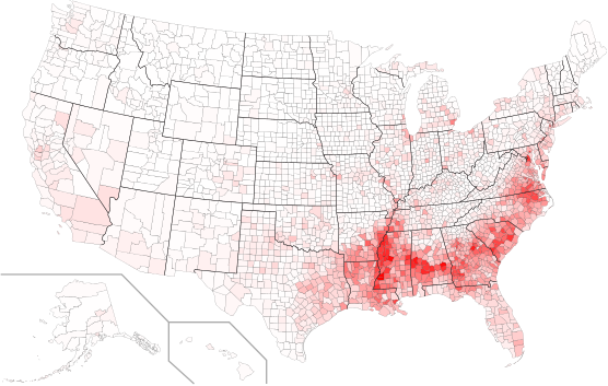
This may require some thought, some research, and some work. Although you are welcome to consider elaborate color maps (even 2D maps representing two quantities), you should beware of creating graphics that are strikingly colorful but difficult for the viewer to interpret. Simple things like a white-to-red gradient can be very effective: the picture below shows the fraction of the population that is of African descent (generated by a student in this class in 2015).
As a first step, beginning automating your editing of USA_Counties_with_FIPS_and_names.svg using the xml parser