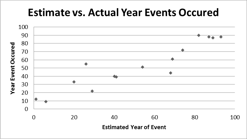
a) Q: Why is it appropriate to use the variable year event occurred as the explanatory variable and estimated year event occurred as the response variable? A: The reason why we do this is to more easily differentiate our response from the actual answer. An easier way to explain this is our estimate was a response and the actual year 'explains' and shows us the reality
b) Q: What would the scatterplot look like if you had guessed the correct year for each event? A: The scatterplot would look as though there is only one set of data. The dots on the image would overlap one another.
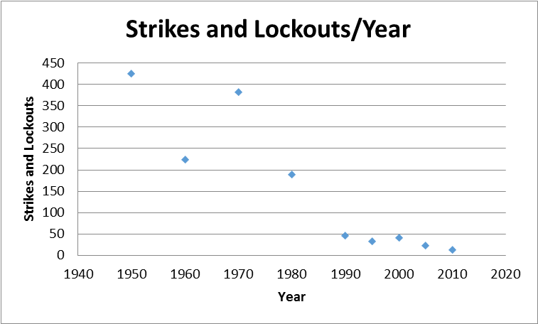
a) Q: Which variable did you use as the explanatory variable when relating the number of strikes and lockouts with the percentage of the total labor force with union membership (in your first scatter plot)? Why?
b) Q: What type of association is there between the number of strikes and lockouts with the percentage of the total labor force with union membership?
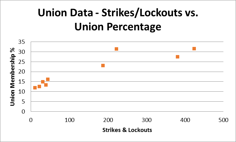
c) Q: Explain what your second scatterplot shows.
d) Q: What type of association is there between the variables you related in your second scatter plot, or are the variables not associated?
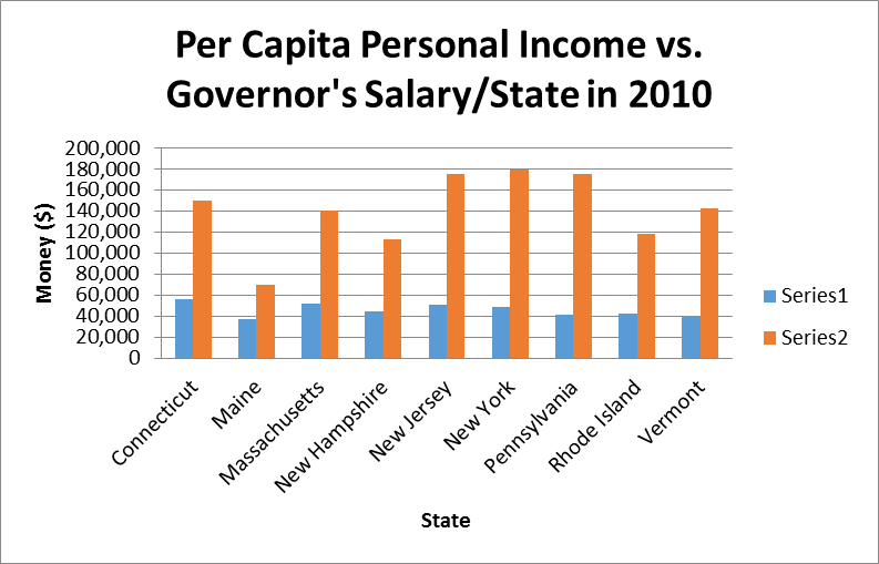
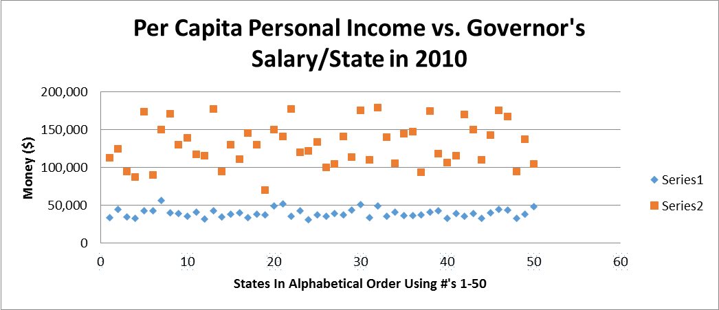
a) Q: Which aspects of the data does the bar graph help interpret? A: The bar graph helps interpret the information using bars to outcomes using heights
b) Q: Is there an association between the variables in your scatterplot? Explain. A: There is no clear cut association between variables in this grpah
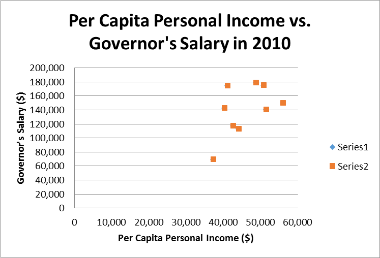
a) Q: Now that we can see all the states, are there any trends or associations in the data? Explain. A: There are no clear cut trends in this data. There is no positive nor negative correlation in the data
b) Q: Are there any data points that appear to stand away from the rest of the data? If so, which one(s) and what makes them stand out. A: There are no data points that stand out from the rest of the pack