CSE 111: Lab 2
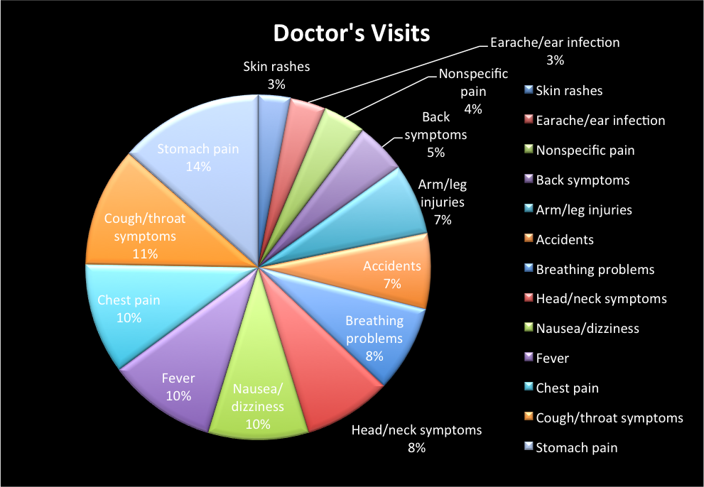
This chart accurately depicts a pie chart in which shows the percentage of why people go to the doctor. We can safely say that the biggest reason why people go to the ER is due to stomach pain.
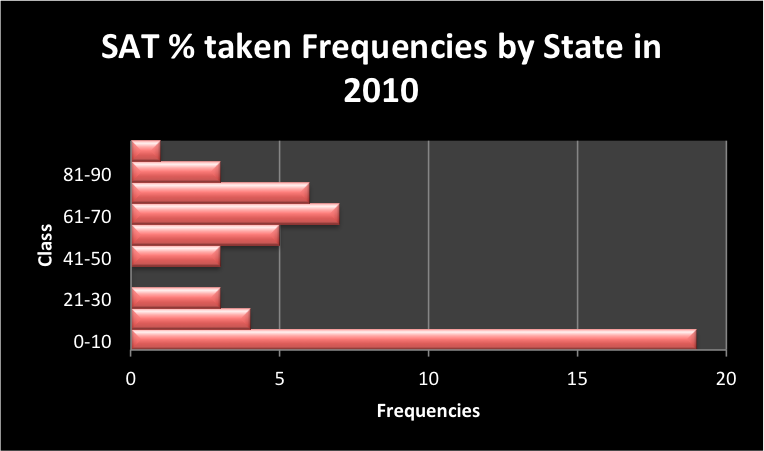
In this chart you will see the % of SAT's taken by state in 2010 (% on the x-axis and state on the y-axis)
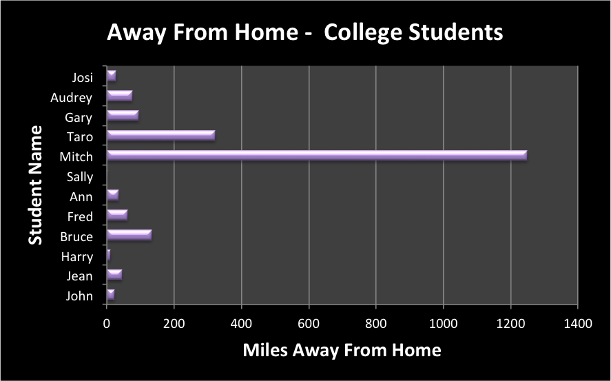
This image shows how far away college students are away from their homes (in miles)... You can see the names on the y-axis and the miles away on the x-axis. We see that Sally does not have to travel to school, while Mitch is over 1,200 miles away from home.
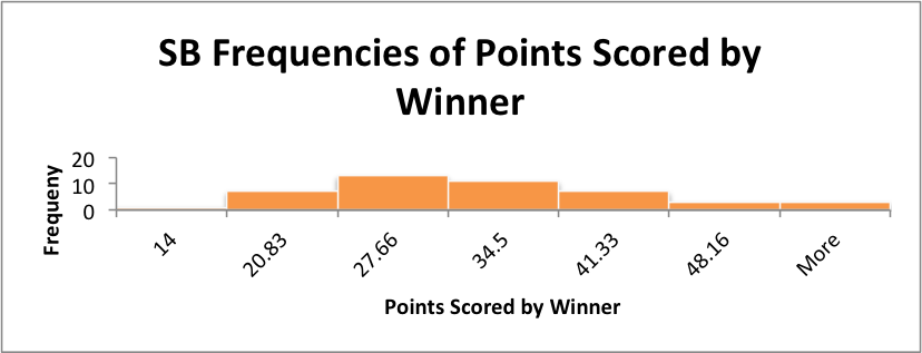
The final chart is based on number of points scored by the winning teams in the Super Bowl. On the x-axis is the bins and in the y-axis you see the frequencies. A conclusion that we can draw from the data image is that when teams win the Super Bowl, the highest tendency is scoring within the 27 point range.
Back