ALT Text
and LONGDESC Text
"Several non-textual elements (IMG, AREA, APPLET,
and INPUT) require authors to specify alternate text to serve as content
when the element cannot be rendered normally."
Think of the text and the image as alternative representations
for content.
When creating ALT text for an image, first determine what the image
is meant to do on the page (how does it enhance the content). It might
be to show an example or an event that is described in the text. It may
show a division between text blocks or do other things. Once you have
determined the reason for the image, it will be easy to determine what
text to put into the ALT tagged field.
View examples of
failures to add the appropriate ALT text (called howlers).
You should also add ALT attributes for areas on image
maps.
Also, consider using the <longdesc> tag to add
more complex descriptions for images and related files.
Color
display as Seen By a Color Blind User
For a good, concise explanation of using color, see: Effective
color contrast for people with partial sight, and its companion article on Making Text Legible.
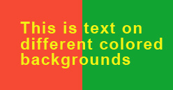
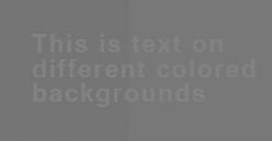
| The two illustrations show the difference between what
the page designer did and what a person with a disability sees on
the screen. In the example, the image on the left has RED, GREEN, and
YELLOW but the colors used have virtually the same VALUE (they are
about the same brightness). The image on the right shows that someone
who is color blind, may not see the intended effect. Keep this in
mind when using color tints for backgrounds. |
|
|
What the designer intended to show |
What the color-blind user sees |
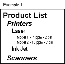
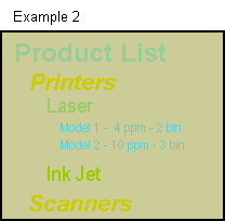
| Contrast of page elements should be high enough to be read or printed without difficulty by any user: |
|
|
High-Contrast |
Low-Contrast |
View these descriptive pages showing visual problems:

|
Tips for HTML Coding
When creating Web pages, use the application's "accessibility" settings
to assist you in writing the code. For example, in Dreamweaver, do the
following:
- Pull down the EDIT menu
- Choose PREFERENCES
- Select ACCESSIBILITY
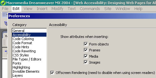
This shows the settings in use.
You may find more about settings and also about making pages more accessible
using the Dreamweaver Help (F1 key) database and asking for "Accessibility" from
the Index (see left illustration below):
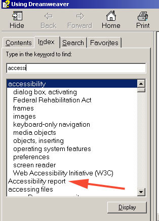 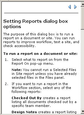
|
You can view instructions and links to additional websites
that will allow you to make your pages accessible-compliant as you create
them. The example on the right (above) shows how you can have Dreamweaver
supply an Accessibility report for your design.
|
|
Some of these are from the WAI
Quick Tips page (with additions)
- Content of web pages is the most important element. Form should always support content and do so without predominating.
- Use all page elements sparingly. Avoid adding images, fancy type faces, animations, color, and "flashy" effects just because you can.
- Images & animations: Use the <alt> attribute
to describe the function of each visual. For longer descriptions
use <longdesc>
- Image maps. Use the client-side map and text for
hotspots. Add <alt> attributes for individual areas.
- Multimedia. Provide captioning and transcripts
of audio, and descriptions of video.
- Hypertext links. Use text that makes sense when
read out of context. For example, avoid "click here."
- Page organization. Use headings, lists, and consistent
structure. Use CSS for layout and style where possible.
- Graphs & charts. Summarize or use the <longdesc> attribute.
- Scripts, applets, & plug-ins. Provide alternative
content in case active features are inaccessible or unsupported.
- Frames. Use the <noframes> element and meaningful
titles.
- Tables. Make line-by-line reading sensible. Summarize.
- Check your work. Validate and also manually check your page (i.e., tab through links, use page without mouse, etc.). Use tools, checklist,
and guidelines at http://www.w3.org/TR/WCAG.
See also the Ten
Commandments of HTML. From the How to Create an Accessible Website
(University of Toronto).
Quick links to:
- Fonts and type sizes: see: Font size. See also: Text.
- Color and Contrast play an important part in making content visible too all. Color should be used sparingly, and mainly to express content concepts, rather than form (visual) aspects. In other words, visual design should be subordinate to content, and should enhance content.
- Layout and structure
- Images
- Multimedia
- Navigation
- Scripts and forms
- Linearisation
- Accessibility and usability. Designers should take manual steps to ensure that their site is both accessible and usable.
- Tables used for layout – layout tables can be used as long as the correct structural markup is used with them.
- Tables used for data – providing structural markup for data tables means people using speech and braille output will know what the row and column headings are.
- Structural markup of content – coding headings, paragraphs and lists correctly allows people who use speech and braille output software to know what a piece of text is for.
- Cascading style sheets – style sheets can be used to give format headings and text in pages.
- Frames – naming frames and providing HTML links within frames allows everybody to navigate pages even if they do not have frames supported.
- Document types – including doctypes allows search engines to list your pages.
- Metadata – good metadata helps people with various needs access your pages from search engines.
From: The Web Access Centre.
|
Sample Pages
Accessible Art Related Sites
- Arts Access
Inc. This site is an example of a Bobby Approved site. It is
also a Winner of the1999 Raleigh Medal of Arts and a Universal
Access Award.
- Dayton
Art Institute. This site is labeled, including extended descriptions
of the exhibit objects.
Success Story Online
- JK Rowling Flash Website: Case Study (Web Access Centre). "The relaunch of JKRowling.com saw LightMaker push the boundaries of accessible Flash. This case study provides an overview of key issues tacked to make the site as accessible as possible."
Website Examples
Websites Moving in the Right Direction
Accessibility Weaknesses

|
Symbols Showing Compliance
 To
show your readers that you have taken the care to create an interoperable
Web page, you may display this icon on any page that validates. Here
is the HTML you should use to add this icon to your Web page: To
show your readers that you have taken the care to create an interoperable
Web page, you may display this icon on any page that validates. Here
is the HTML you should use to add this icon to your Web page:
<p> <a href="http://validator.w3.org/check?uri=referer"><img
src="http://www.w3.org/Icons/valid-xhtml10" alt="Valid XHTML 1.0!" height="31" width="88" /></a> </p>
 Web
Access Symbol (Web Access Project ) Web
Access Symbol (Web Access Project )
Description: A globe, marked with a grid, tilts at
an angle. A keyhole is cut into its surface.
The symbol should always be used with the following
alt-text tag:
Web Access Symbol (for people with disabilities)
The Web access symbol is also available via anonymous
ftp at ftp.wgbh.org.
The CPB/WGBH National Center for Accessible Media
(NCAM) is pleased to announce that the Web Access Symbol, shown above,
is available for use! Chosen from among 17 symbols, this image may
be used by webmasters to denote that their site contains accessibility
features to accommodate the needs of disabled users. The symbol should
always be accompanied by its description and alt-text tag. This image
was created by Stormship Studios of Boston, Massachusetts.
|
Additional Resources
- Download
Adobe Reader. The full version of Adobe Reader includes features
that enhance the accessibility of PDF documents.
- Create
accessible content. Adobe products make it easy for authors
to create and distribute accessible content.
- Comply
with mandates. Learn how Adobe products help government agencies
comply with accessibility mandates such as Section 508 of the
U.S. Rehabilitation Act.
- Convert
PDF content. Learn how to use an online conversion tool to
extract content from a PDF file and have it delivered to you
in ASCII text or HTML format.
- Creating Accessible
Macromedia Flash Content (WebAIM pages).
 Disability Access Symbols. Twelve symbols you can download to show that your web page provides access for various forms of accessibility, or to use when describing these assistive technologies on an information page. Disability Access Symbols. Twelve symbols you can download to show that your web page provides access for various forms of accessibility, or to use when describing these assistive technologies on an information page.
|